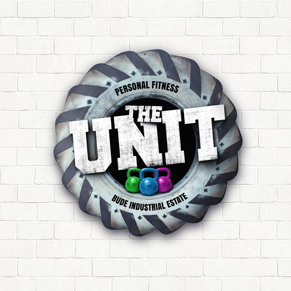
Personal Fitness Logo Design for The Unit in Bude
Heidi Redman approached me to design a logo to help her get noticed and stand out from the other fitness coaches in and around Bude.
While we were discussing the logo, I quickly came to the decision to use the bricks (from The Unit) as the background texture and use the tire as the focused point of the logo. The reason for doing is that traditionally people use silhouettes of arm muscles in their logo, and as Heidi incorporates tyres into her fitness activities it seemed the nature thing to do.
The logo was so much fun to work on as I absolutely love designing something different which hasn’t been done before!
