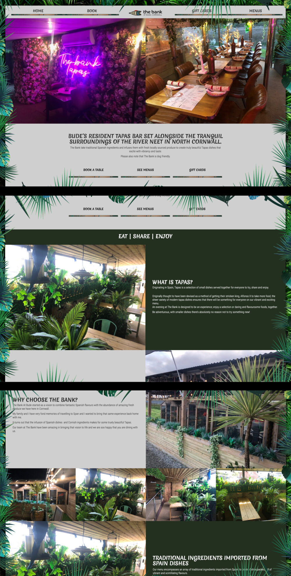
When I was tasked with creating a website for The Bank at Bude, I knew that it had to be something special.
I didn’t want to just create a simple, static website; I wanted to create something that would stand out and catch the eye of visitors.
The idea came to me when I was watching a nature documentary on TV, and saw some leaves blowing in the wind. They looked so beautiful as they danced around in the breeze—and so natural! So I thought: what if we could make our website look like that?
After doing some research and finding out about CSS3 animation, I decided to try making my dream come true. It took me a few hours of experimentation, but eventually I came up with an animation that worked smoothly and looked beautiful on screen.
Now whenever you browse around our website, you’ll notice that the leafs around the edge start very slowly moving from left to right or vice versa—just like real leaves do in nature!
>> Visit Website
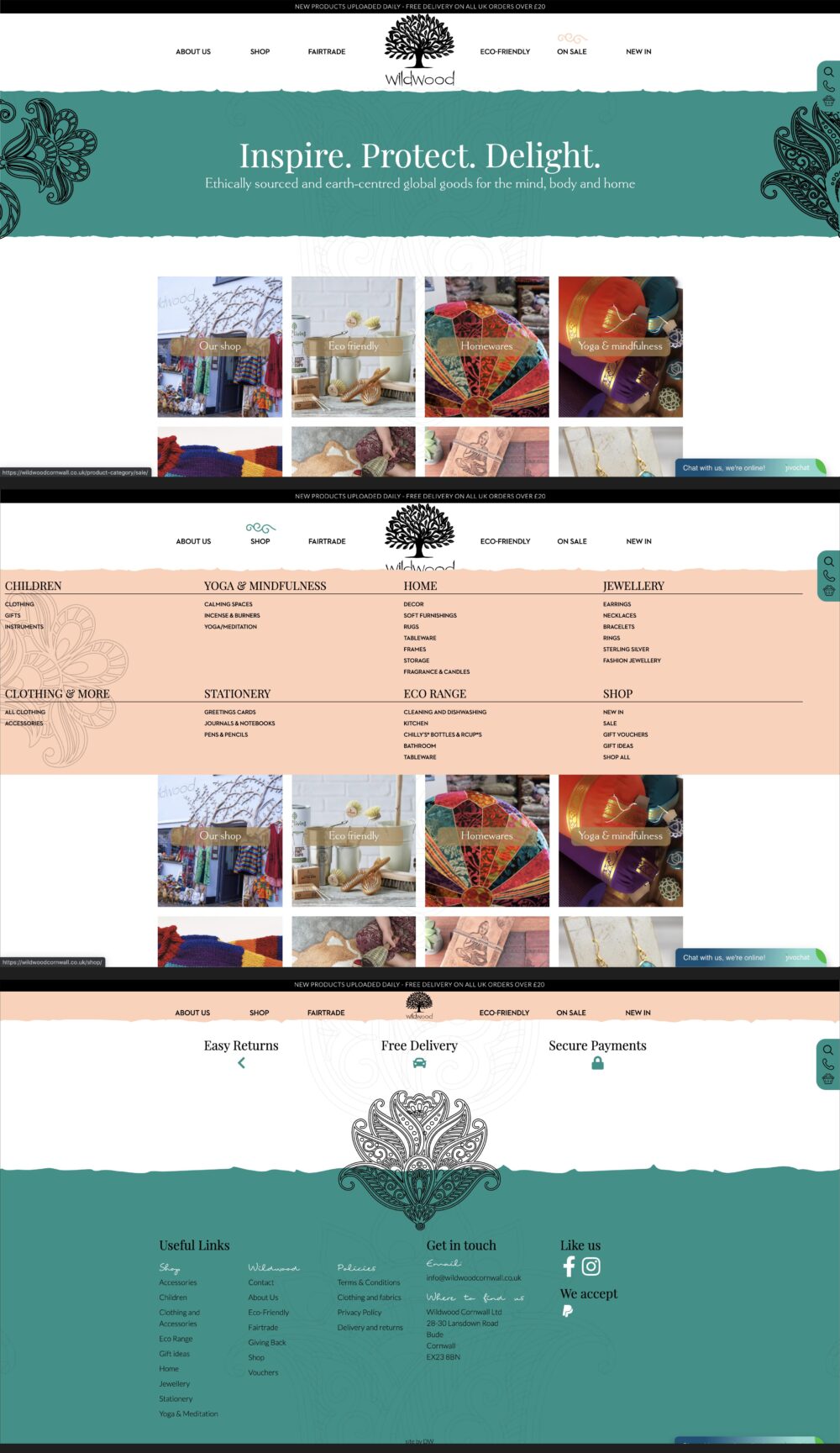
Wildwood Cornwall approached me to ask whether I would be interested in building a bespoke e-commerce website using WordPress and Woocommerce – I immediately said yes, of course. The requirements were somewhat different though; in that, the owners of Wildwood had a vision of the style and design of the website ready in their minds. This made the site an exciting new challenge as it is a style type that I’ve never undertaken before – I love clients that have different approaches to something that is already out there, it gives me the freedom to help a business to standout from the crowd.
As a website developer, this freedom also makes developing unique features a breeze as opposed to re configuring off-the-shelf themes and limiting the functionality and creativity of the website. One feature I was quite excited about implementing when designing the site visual, was the ability for the graphics to be hand-drawn onto the website while you are browsing. This gave it a nice unique touch whilst also making the website dynamic.
If you are looking for a website to be built from scratch, then feel free to contact me to discuss your requirements – however big or small.
>> Visit Website
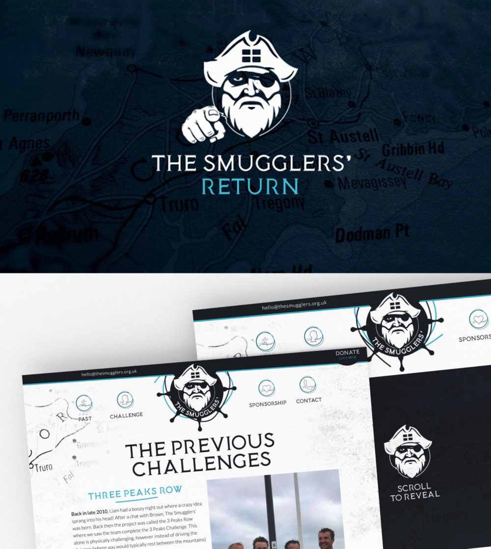
After two amazing challenges which raised well over 30 thousand pounds – Three Peaks Row and The Smugglers’ Challenge have now returned to take on another challenge – The Smugglers’ Return.
Having been involved in the previous challenges with the branding and websites it was an obvious choice for them to approached me. The brief was to create an umbrella branding and a central website for all previous and upcoming challenges whilst giving them complete control of the content and pictures. And most importantly to me, I had complete freedom to design the website and how it interacts to users.
I created a new brand identity reflecting something completely different to what you would typically expect from a charity whilst making you curious about what the charity is about. The result was a silhouette of a character/pirate that jumps Cornwall out at you whilst also bringing the craziness of the charity. The website was built using WordPress and a custom-built theme that allowed me to make it unique to the Smugglers instead of using a theme which looks similar to everyone else.
I am pleased with the result, especially as I had given complete freedom to be creative with not only the logo but the website as well.
If your looking for Bude branding or would like to set me a new challenge, then feel free to contact me using my contact page to discuss your branding requirements.
>> Visit Website
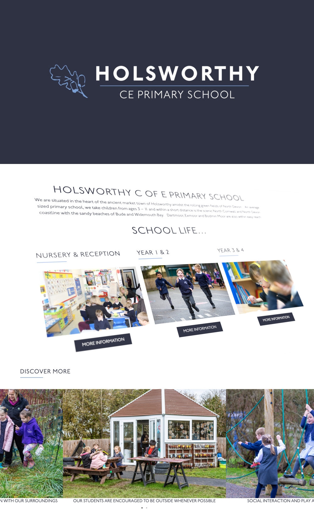
Holsworthy C of E Primary School is situated in the heart of Holsworthy and graded ‘good’ in all areas by Ofsted.
I was really excited when Tim from Holsworthy CE Primary School approached me to revamp their current branding and website. I have always wanted to produce a modern, fresh and engaging school website from the earliest years of my business so this provided me with the perfect opportunity – I just couldn’t wait to get stuck in.
I began by updating the current branding, giving it a more elevated, professional and refreshed look. This meant changing the branding’s colour scheme, to make it stronger and to place emphasis on the quality and care that their education provides. I decided to use blue tones so that it was welcoming to both genders which was also an important requirement.
For the website, Tim requested the ability to add news articles and pages on the website using a content management system. I decided to go one step further and use a content management system with a page builder called Elementor which provides administrative users with full control of the layout for each page. This was a perfect solution and has allowed Tim to easily create new pages as and when required.
The website needed to be easily found using search engines, have quick page load times and an intuitive user interface on both desktops and mobile devices. The end result produced a website that I really pleased with.
>> Visit Website
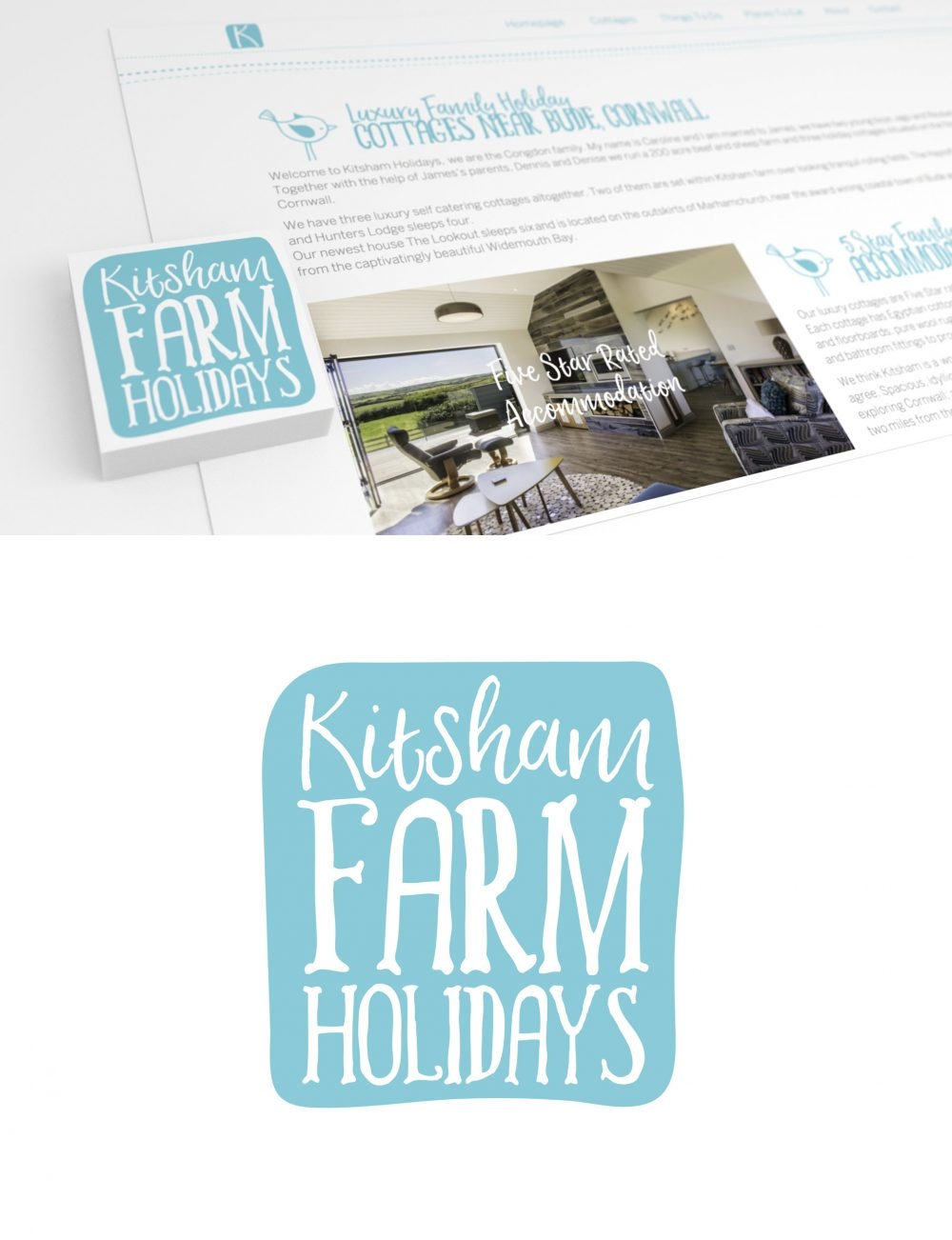
Caroline from Kitsham Holidays approached me to look at their branding and give it a refreshed look. The aim was to make the branding more appealing to a younger generation customers and to make Kitsham stand out in a very crowded sector. This lead to a new website design, to match the re branding .
The branding produced uses a colourful and relaxing teal/blue colour scheme which appeals to both young and middle aged audiences. The shape of the logo follows a smooth curve effect to give give it a funky feel which you would not typically see associated with a holiday cottage business.
Following on from the style and feel of the branding, I decided to incorporate some bird illustrations to give the design some character and life, to make it bounce and stand out a little more. This has also helped the reader to follow the layout and flow of the new web pages.
Instead of using subtle background colours to separate the different sections, I wanted to further follow the style of the branding by using funky and quirky dashes to separate the sections. This broke one of the design rules of symmetrically, as the lines are not perfectly equal to each other, but this was the right decision for Kitsham as the are trying to appeal to younger generation of couples and families, in addition to their existing customer base.
If you like the clear/funky look designed for Kitsham Holiday Cottages, then feel free to contact me via the contact page to discuss your branding requirements.
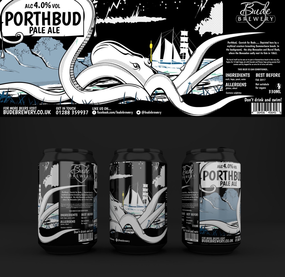
Adam at Bude Brewery in Cornwall, approached me to produce a unique graphic for a new beer product – Porthbhud. Below are the project’s specifics.
- The design must target the 25 years+ age group.
- The designs should convey a sense of fun whilst also incorporating a modern touch.
- The labels must include all legal requirements
- The labeld must include Barrel Rock within the design
As soon as I was given this brief I went to Barrel Rock with a camera and took some photos. Using these photos, I started drawing Barrel Rock and the surrounding features. However, I soon felt the design was lacking something, so I started sketching an octopus as I could visualise wrapping the creatures legs around Barrel Rock which would fit the brief perfectly.
After that, the look came together really quickly and the end result put a huge smile on the faces of the guys at Bude Brewery. I can’t express how much fun this design was to put together!
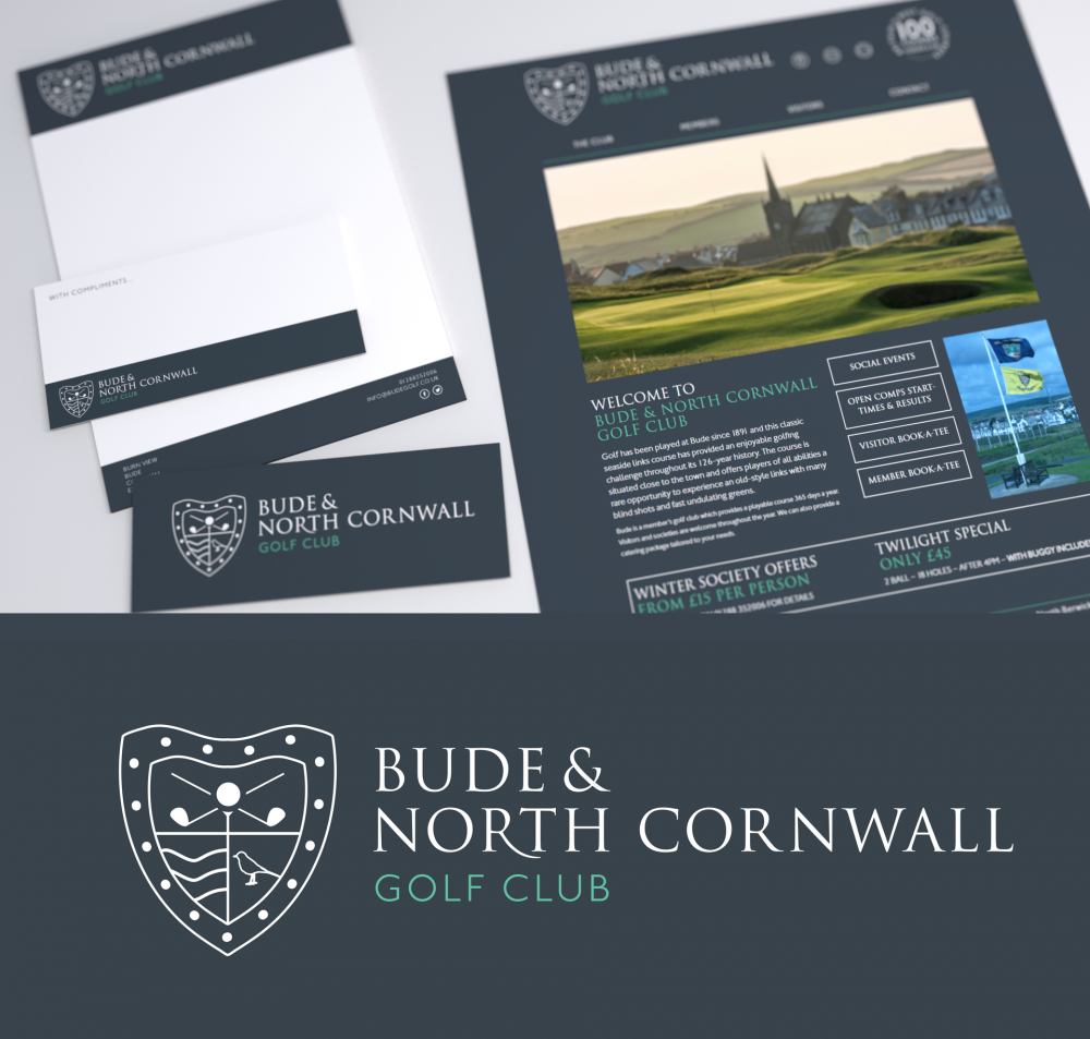
Bude & North Cornwall Golf Club were looking to update their existing website. My brief was to make it easier for internal employees to update the site without requiring any prior knowledge of html, whilst also improving the site’s design for use as a marketing tool in attracting more members to the club.
The existing site was outdated and unfriendly to those wanting to view it from their tablet or phone. The website was hard coded and required existing knowledge of HTML and CSS in order to implement changes. With that in mind I refreshed the site, making it easy for staff to update by using WordPress as a CMS platform and of course, ensured it was appealing and easy to navigate on mobiles and all other devices. Whether you are looking for membership prices or tournament results, you will be able to quickly find what you are look for with their new website.
If you’re keen to give golf a go then take a look around their site for yourself.
>> Visit Website
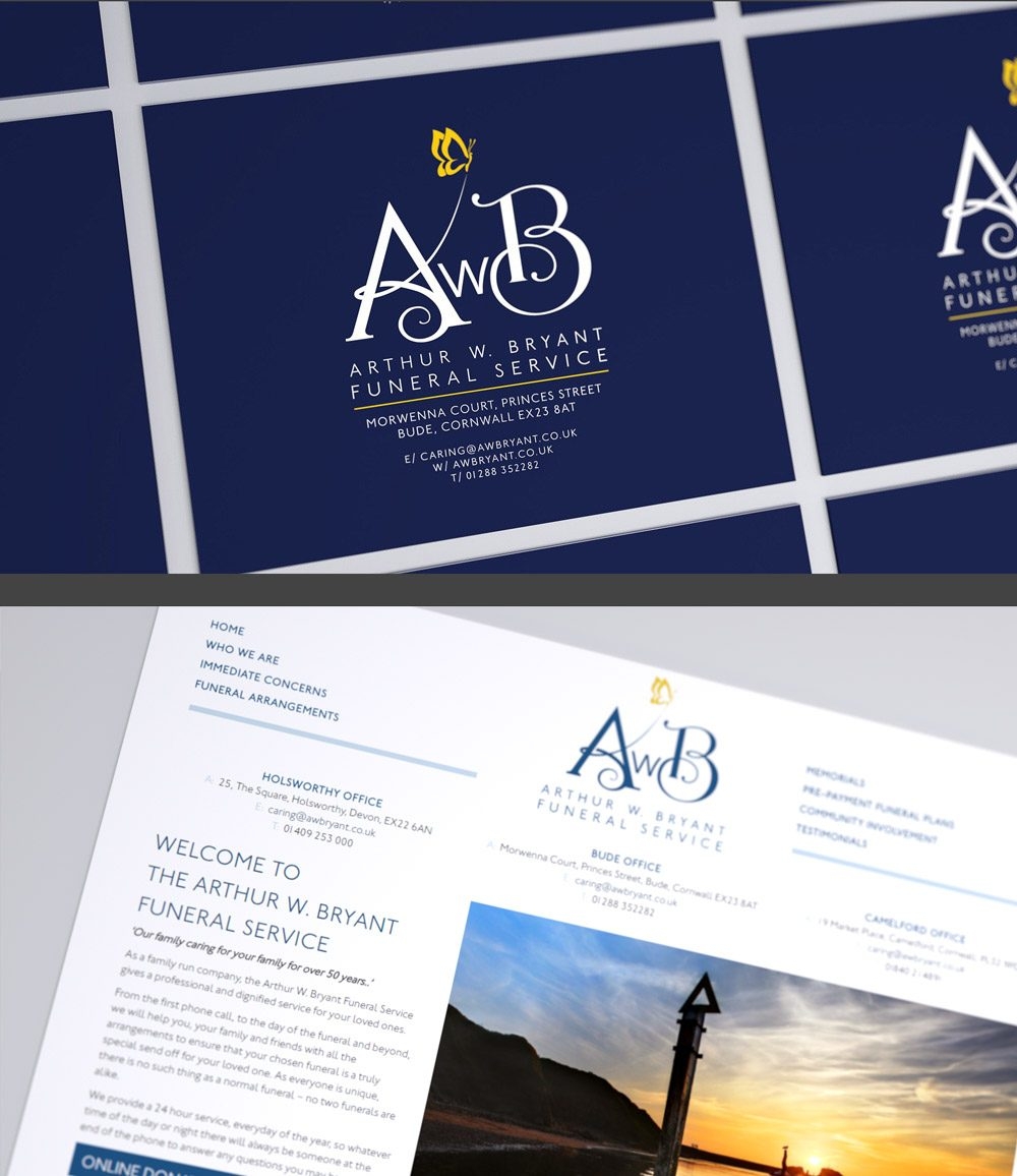
Arthur Bryants contacted me to rebrand their company with a new image, as they felt it was getting a bit stale and needed some modernising.
This project involved producing a logo that could be used across all of their marketing and printing materials as well as producing a responsive website to work effortlessly across all devices.
As a family run company, it was essential to convey the quality and uniqueness of their services as well as their incredible reputation which has been built over 50 years. Therefore, special attention had to be paid to the typography used.
I created a logo that was balanced, clean, modern and suitable to sit on any background. The yellow butterfly adds a distinguished quality to the label. The style of the logo quickly dictated the style and layout of the website.
If you like the clear/stylish look designed for Arthur Bryants, then feel free to contact me via the contact page to discuss your branding requirements.
>> Visit Website
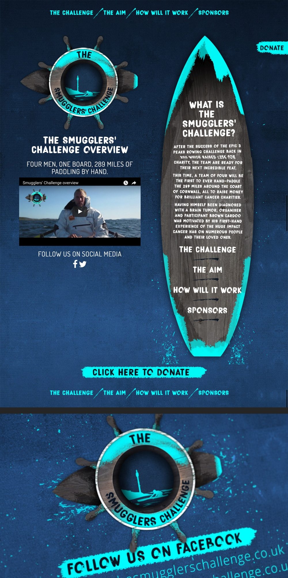
Liam and the team from 3 Peeks Row which saw athletes scale Britain’s three highest mountains: Ben Nevis, Scafell Pike and Mount Snowdon by running, cycling and rowing the entire 478 miles, successfully raising 25k for charity, have decided to take on yet another challenging fundraiser called – The Smugglers Challenge.
The reason behind this new challenge is due to Brown being diagnosed with a brain tumour. The aim is to raise as much money as possible for both the renowned national charity – Cancer Research UK, and The Force, supporting those diagnosed with cancer locally.
Having completed work previously for 3 Peeks Row, Liam approached me asking whether I would like to sponsor the new challenge by producing all the challenge’s branding/graphics and its website.
I produced (what I think) is quite a quirky and very eye catching logo. I also produced a bespoke website that doesn’t utilise templates. This allowed me to develop an interactive website combined with animations in such a way that the content of the pages was within the paddle board. I then integrated further animation showing splashes falling off down the side of the website – you don’t see that often within a website do you?
If you are looking for an interactive website then feel free to contact me via my contact page to to discuss your requirements.
>> Visit Website
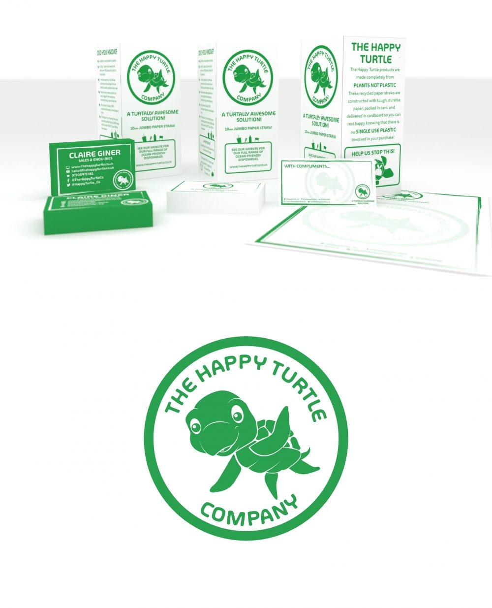
I was approached to produce branding for The Happy Turtle Company in Cornwall. The company provides plastic free solutions to companies in and around Cornwall, working indirectly with A Greener Bude and the Bude Cleaner Seas Project.
The branding consists of green colour to coincide with the environment surroundings as well as a clean quirky but clean typography. As the name suggests, a hand drawn cartoon turtle was drawn up and illustrated that acts as a mascot for the company. From here straws, letterhead, compliments slips and cups were designed based around the green and turtle branding.
Whether your an organisation, small business or a medium business feel free to get in touch to discuss your requirements.
>> Visit Website
