Kitsham Holiday Cottages Website Design
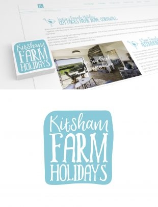
Caroline from Kitsham Holidays approached me to look at their branding and give it a refreshed look. The aim was to make the branding more appealing to a younger generation customers and to make Kitsham stand out in a very crowded sector. This lead to a new website design, to match the re branding .
The branding produced uses a colourful and relaxing teal/blue colour scheme which appeals to both young and middle aged audiences. The shape of the logo follows a smooth curve effect to give give it a funky feel which you would not typically see associated with a holiday cottage business.
Following on from the style and feel of the branding, I decided to incorporate some bird illustrations to give the design some character and life, to make it bounce and stand out a little more. This has also helped the reader to follow the layout and flow of the new web pages.
Instead of using subtle background colours to separate the different sections, I wanted to further follow the style of the branding by using funky and quirky dashes to separate the sections. This broke one of the design rules of symmetrically, as the lines are not perfectly equal to each other, but this was the right decision for Kitsham as the are trying to appeal to younger generation of couples and families, in addition to their existing customer base.
If you like the clear/funky look designed for Kitsham Holiday Cottages, then feel free to contact me via the contact page to discuss your branding requirements.
