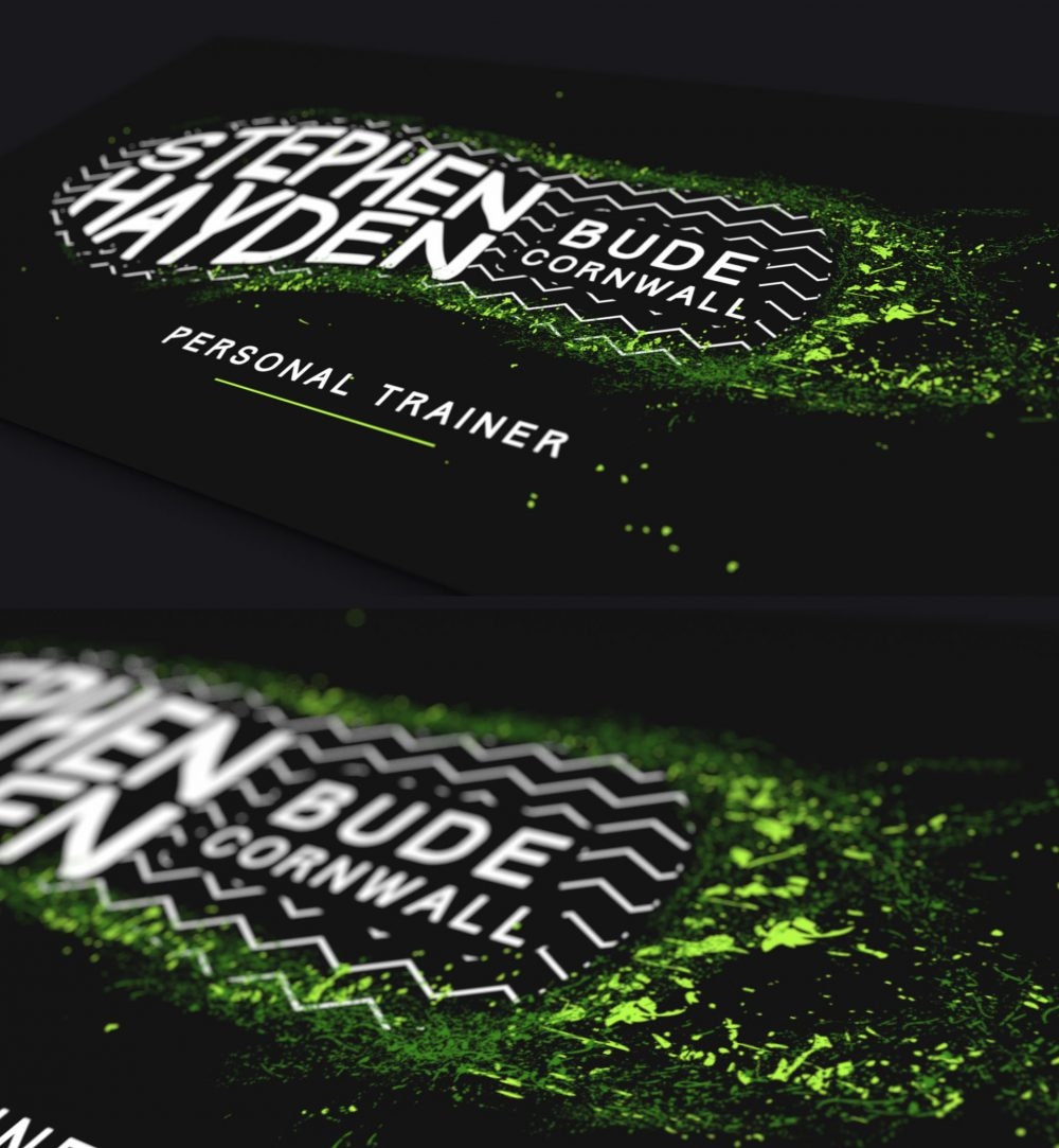
Stephen Hayden from Bude approached me to design a logo for his new adventure as a personal fitness trainer.
This was a great project for me – I’m a big tennis/fitness fan so of course I enjoyed getting to grips with the brand ethos which involved identifying the current design trends within the fitness industry! For Stephen’s brand identity I designed a really bright Nike style trainer shape with a funky fitness green colour being splattered from its imprint . The splats were also used as an expression of movement/fitness from the trainer. A pattern was also developed within the shape to reinforce that the design was the bottom of a trainer.
Whether I am starting from scratch on a ‘brand new’ brand, or refreshing an existing one, my ultimate aim is to deliver a design that is a bit different by combining creativity, flare and an understanding of my clients’ needs. If you are interested, feel free to contact me by clicking here.
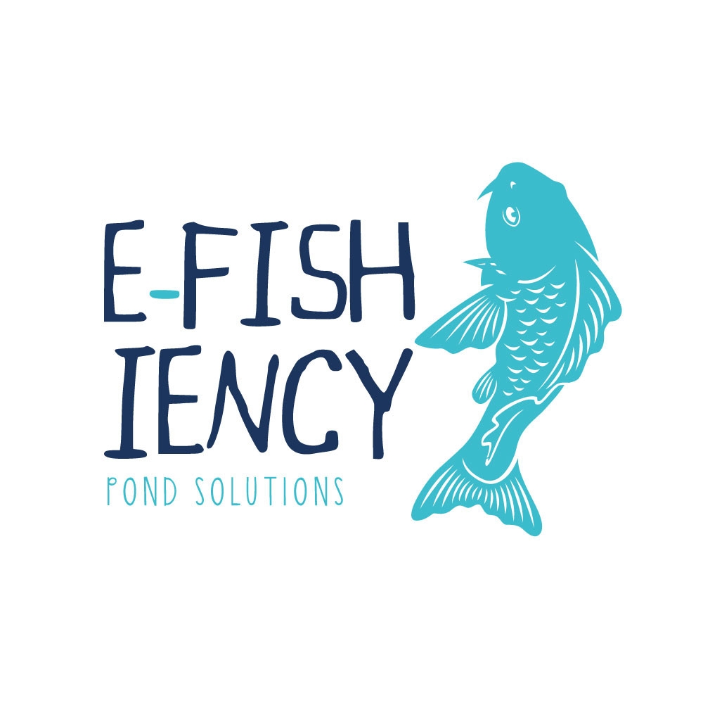
E-fish-iency Pond Solutions is a pond contractor based in Cornwall, specialising in pond, lake and water feature installation, design and maintenance throughout Cornwall and Devon.
Dan from E-fish-iency Pond Solutions approached me to help him with branding. I created a new look to reflect his knowledge and experience in aquatic.
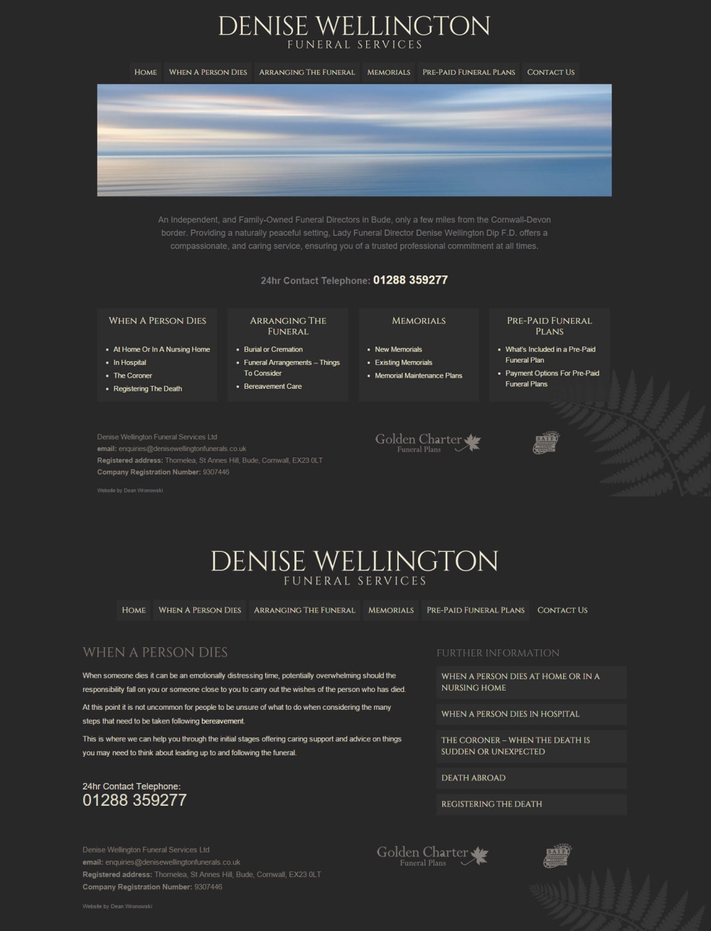
A new website for Denise Wellington Funeral Services, Bude Based Funeral Directors. The new website has a fresh and modern design which reflects the professionalism and dignity of the service that Denise and Darly offers.
The site is an extremely user-friendly, WordPress-powered, fully responsive website, for anyone organising a funeral in and around the Bude, Cornwall areas.
For all things web design cornwall, I’m ready to start work. Drop me a line to start discussing.
>> Visit Website
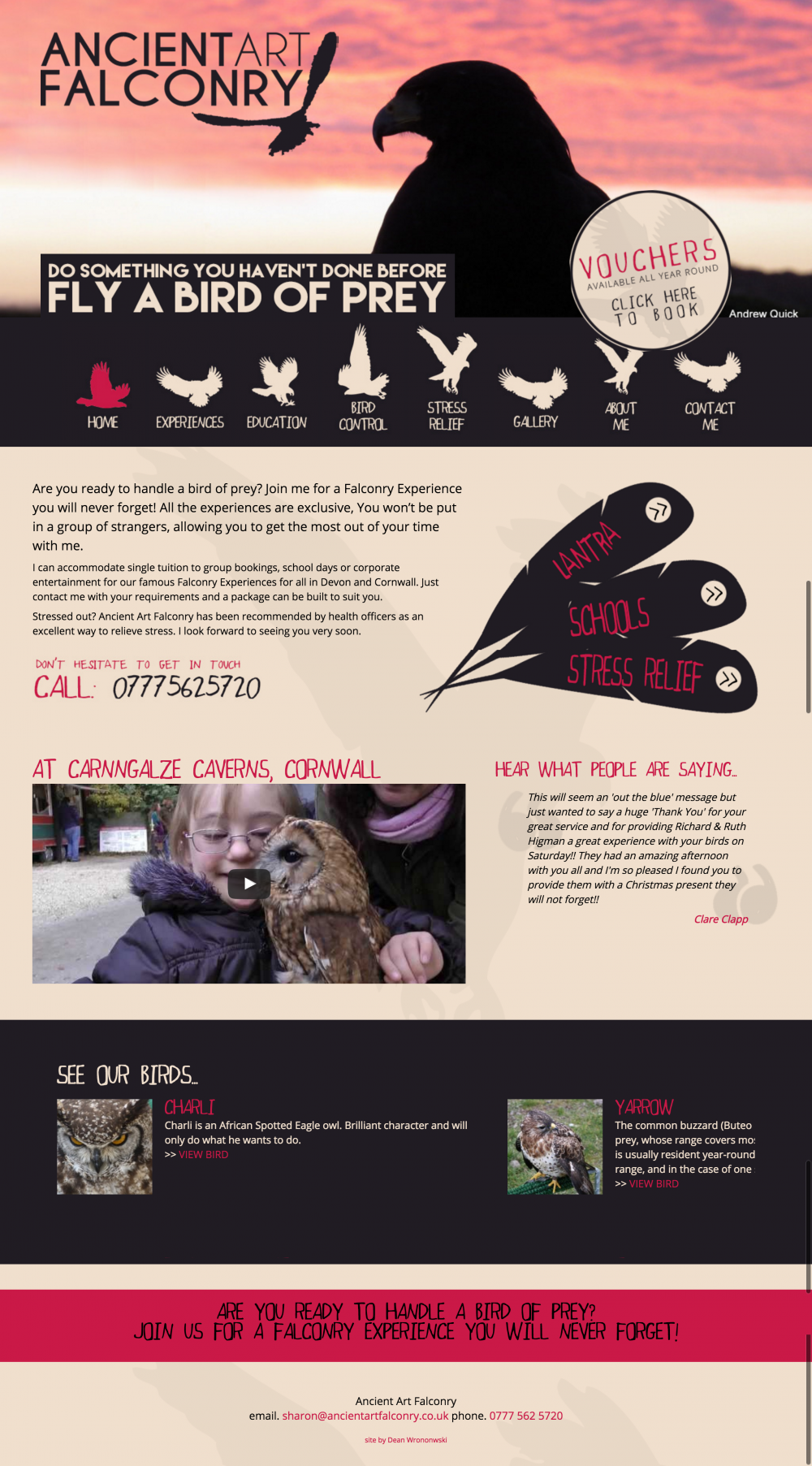
Sharon was looking for a website revamp/refresh for Ancient Art Falconry. Sharon offers falconry Experience Days in and around Cornwall for the general pupil as well as educating children in schools about birds of prey.
Most people will have Smart phones and/or tablets, therefore Sharon requested the new website to be a responsive design to make it easy to view on a variety of different devices – particularly mobiles. Furthermore, she required the new website needed to be found easily by key search engines including Google, Bing and Yahoo and be optimised for falconry search terms.
With a basic colour palette combined with silhouettes of birds of prey as the menu icons, the end website design worked out really well.
>> Visit WebsiteDean was very thorough and professional in setting up my Website. He took time to understand what I do and helped me get the best results for what I wanted to achieve. Although he has long finished my website he is always at the end of the phone for any tweaks which is a good piece of mind for me. I would recommend Dean and have done since working with him.
Sharon - Ancient Falconry
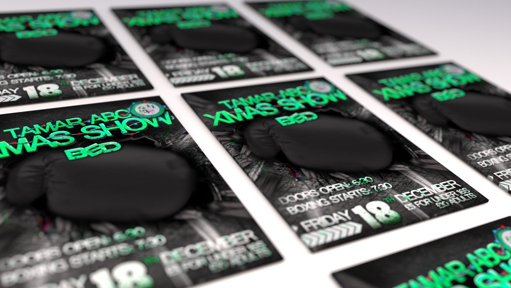
Bude Tamar Boxing Club is amateur boxing club for any one to join, any age or ability.
When Ross approached me to do a poster design, Ross already had a strong idea of how he wanted it to look. This can sometimes make my job difficult as it’s hard to recreate exactly what a client has in their head. The requirement was to design a poster to advertise the Christmas Boxing event but to have a quirky design. After some research, It soon became obvious that most boxing designs involve pictures of boxers fighting. But as Ross was looking for something different. I decided to utilise the bricks from the venue with a boxer punching/smashing through the bricks.
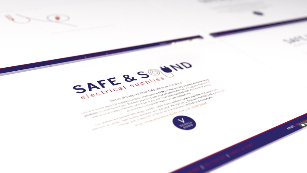
Andrew from Safe and Sound in Bude was looking to get his current website revamped to bit more quirky and different. After some research, I soon realised most electrical supply websites have a similar layout; Andrew on the other hand was looking for a bit different.
As the logo was clean and simple the layout had to follow suit. I decided to utilise the wiring of the logo to design the website. The end result included a wire being drawn down the page as you scroll; revealing different electrical components with various captions.
The technology behind the website was a bit of an HTML5 and SVG experiment to see how it would work.
Overall, it was an ace project to undertake and learn various things along the way.
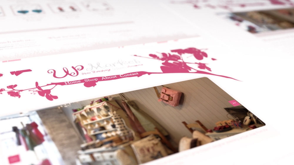
Lydia was looking for simplistic ecommerce website for her family business – Up Market Gifts in Holsworthy.
The requirements for the website design was for it to be simple, easy to navigate and mostly importantly to look beautiful. I recommended that we used silhouettes so that the website loads quickly, but also allows the design to be simple. We decided to draw silhouettes of objects from the shop with the colours matching the branding – pink and white.
Furthermore, to make the website a bit quirky. We decided to use an interesting silhouette as the background of the menu – which ended up being a flower across the top of the website.
>> Visit Website
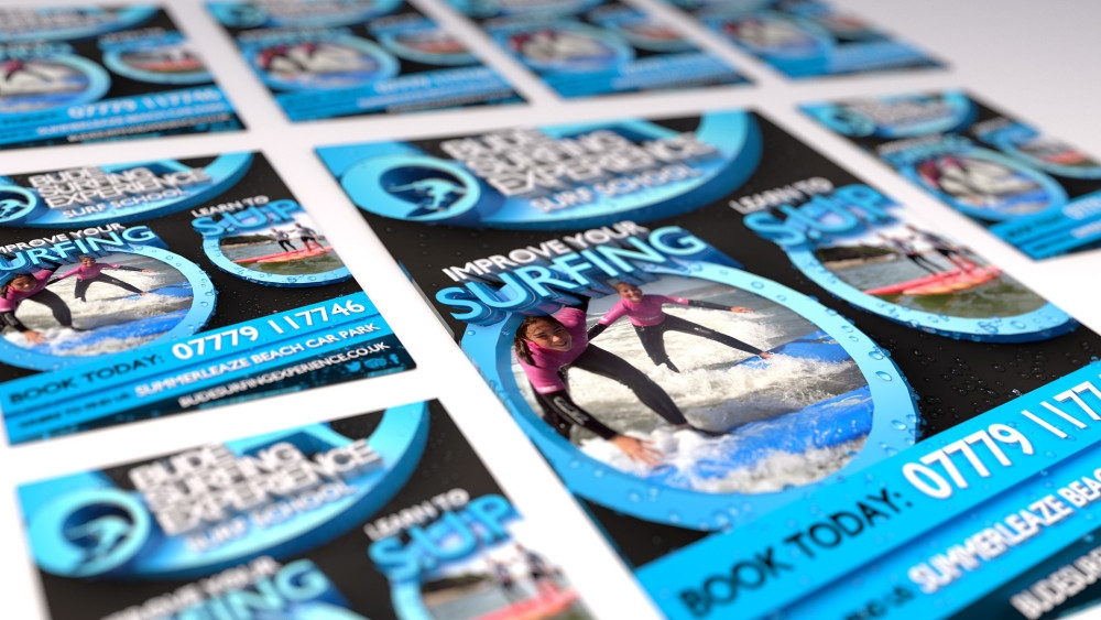
Scott from Bude Surfing Experience asked me to design an advert to be featured in Bude’s Tourist Information Guide.
It was important that the design was consistent yet individual, which was achieved through the use of vibrant colours and 3D typography. A 3D water particle system was also implemented giving the poster a realistic water effect.
Dean can basically take any idea and make it happen on the computer screen
Scott Marshall - Bude Surfing Experience
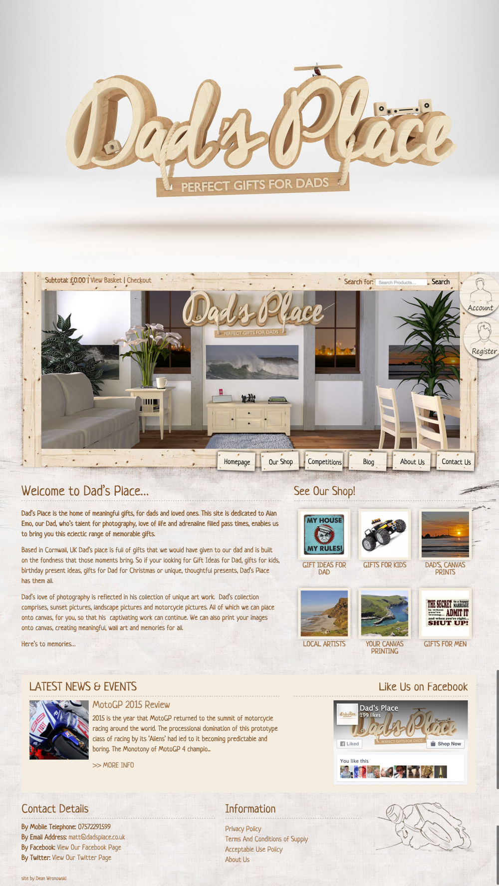
Following a successful website for Devilishly Disabled, Matt required another dynamic and unique looking ecommerce website as well as some branding for a new business – Dad’s Place. The idea behind Dad’s Place is to offer high quality gifts for Dad’s and loved ones in and around Bude, Cornwall.
The objective of the website was to create an online ecommerce website full of gifts for Dad’s, Gifts for Kids, birthday present ideas and gifts for Dad for Christmas. The website had to be attractive and appealing, to achieve this a series of hand drawn sketches were produced to give the website to have a relaxed feel whilst also giving the website a seaside feeling. The sketches were based on some of the products that are on offer on the website.
The site was designed to be very easy to use, letting users pick and choose the products they wished to investigate further. Each user has their own account area where they can upload your own canvas pictures (to be printed) and to send messages to and from the admin’s of the website.
The website was a bespoke website made by using WordPress (as the content management system) and the Woocommerce (as the ecommerce system) allowing for flexibility which was perfect for the needs of Dad’s Place.
I absolutely loved working on this website toooooo much fun! Go check it out – www.dadsplace.co.uk
>> Visit Website
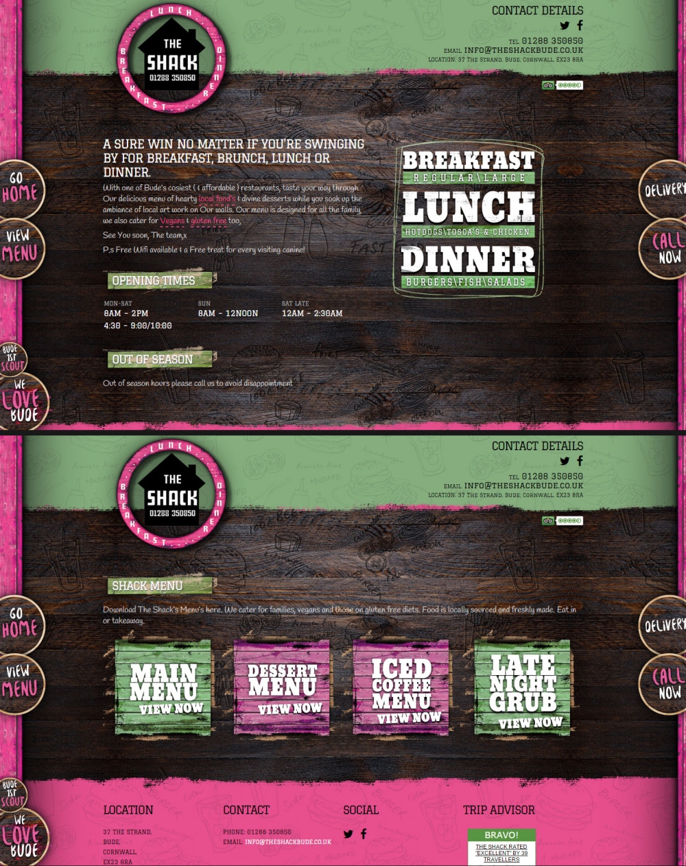
Jake and Michelle from The Shack restaurant, were looking to revamp their current website to better utilise their branding.
This solution came together after quite a number of detailed discussions. The design that you see here developed smoothly and the reaction from my client was fantastic. The end result involved using the branding colours – pink and green – combined with some natural wood, similar to the interior design of the restaurant. As the logo was circular, I decided to use circle shaped buttons for each of the menu items hanging from the wooden pillars. Hovering over the menu buttons causes them to bounce, giving life to the website and adding to its unique design.
This bold and edgy design really brings home the atmosphere of the restaurant and boy was it fun to create!
>> Visit Website
