Logo Design For Bude Based Personal Fitness Trainer
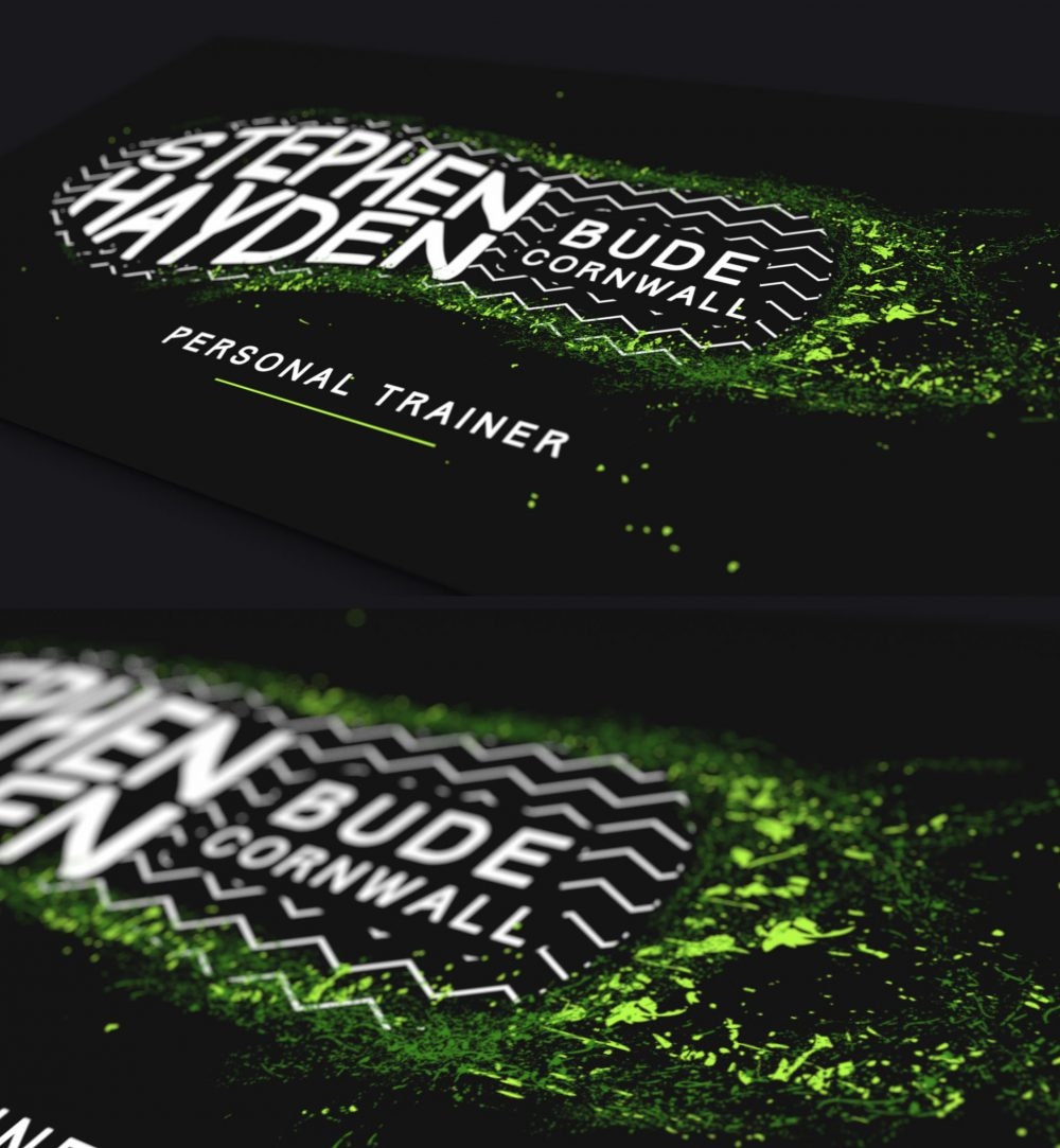
Stephen Hayden from Bude approached me to design a logo for his new adventure as a personal fitness trainer.
This was a great project for me – I’m a big tennis/fitness fan so of course I enjoyed getting to grips with the brand ethos which involved identifying the current design trends within the fitness industry! For Stephen’s brand identity I designed a really bright Nike style trainer shape with a funky fitness green colour being splattered from its imprint . The splats were also used as an expression of movement/fitness from the trainer. A pattern was also developed within the shape to reinforce that the design was the bottom of a trainer.
Whether I am starting from scratch on a ‘brand new’ brand, or refreshing an existing one, my ultimate aim is to deliver a design that is a bit different by combining creativity, flare and an understanding of my clients’ needs. If you are interested, feel free to contact me by clicking here.
