Dean recently created an excellent animated logo for my website, Bude & Beyond (www.budeandbeyond.co.uk). What I never realised at the outset was how much time, effort, discussion, creativity and dedication goes into producing a logo. After an initial discussion, Dean created many versions, in different colour schemes and formats, which he also animated. He sought appropriate feedback and went the extra mile to ensure that the colours and design were absolutely spot on. I was very impressed at his determination to get it right and to re-create and adapt until both he and I were both very happy with the final result.
So, I’d say Dean’s major strength is communication. I’m not IT-focused, but I appreciate a good-looking website/logo, so it really helps that he is able to discuss ideas in a friendly and accessible way, without over-use of jargon. He explains things well, and will interpret ideas in a client-focused way. He is extremely responsive, so wait times are very short. He listens to his client and creates ideas based on what he hears/understands. He checks all along the way (wording, colours, images, positioning) and will ask: what if we try this? He is also very open to constructive comments. Therefore, he provides plenty of guided choice.
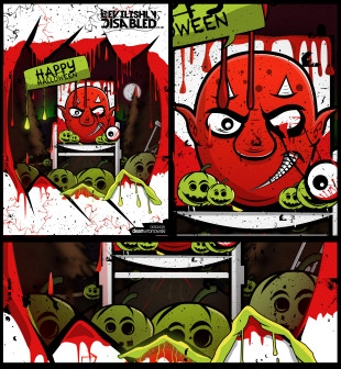
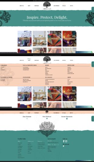
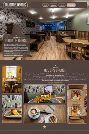
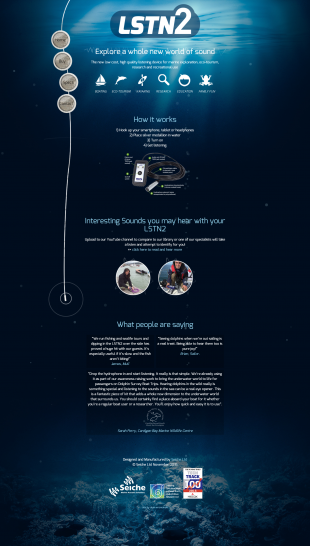
I’m rather proud to now have a Dean Wronowski animated logo already in use on my social media and ready for my website (currently undergoing a major revamp). Dean’s designs are his trademark. Fresh, colourful and lively, they always try to encompass the nature of the product he is working with.
He is a remarkable talent which Bude is fortunate to have
